THE ASK
To create a bespoke fast food burger store that appeals to royalists looking to experience a taste of regality in their own lives, even in the most unexpected of places...
THE SOLUTION
Understanding the target audience was the route to this brief. These are royalists who look to the royal family and their heritage as not just celebrity icons, but a symbol of a lifestyle they too would like to experience. Pomp & Patty offers them this opportunity, although being just a fast food store the brand explores this in a comically exaggerated way to display the clash of the pairings. Worship to The King is replaced with worship to The Patty whilst patriotic British references draw back to the theme of burgers.
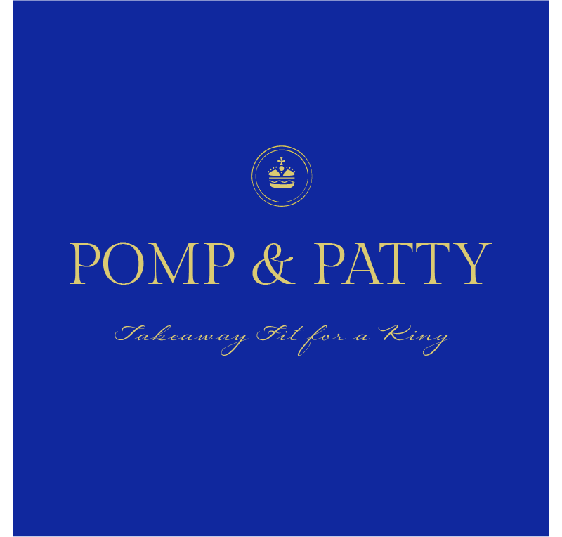
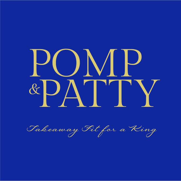
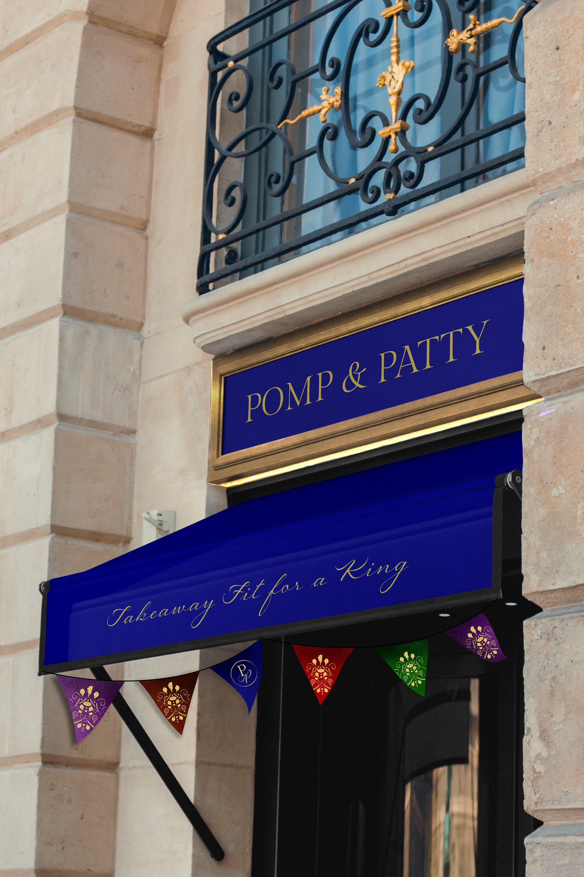
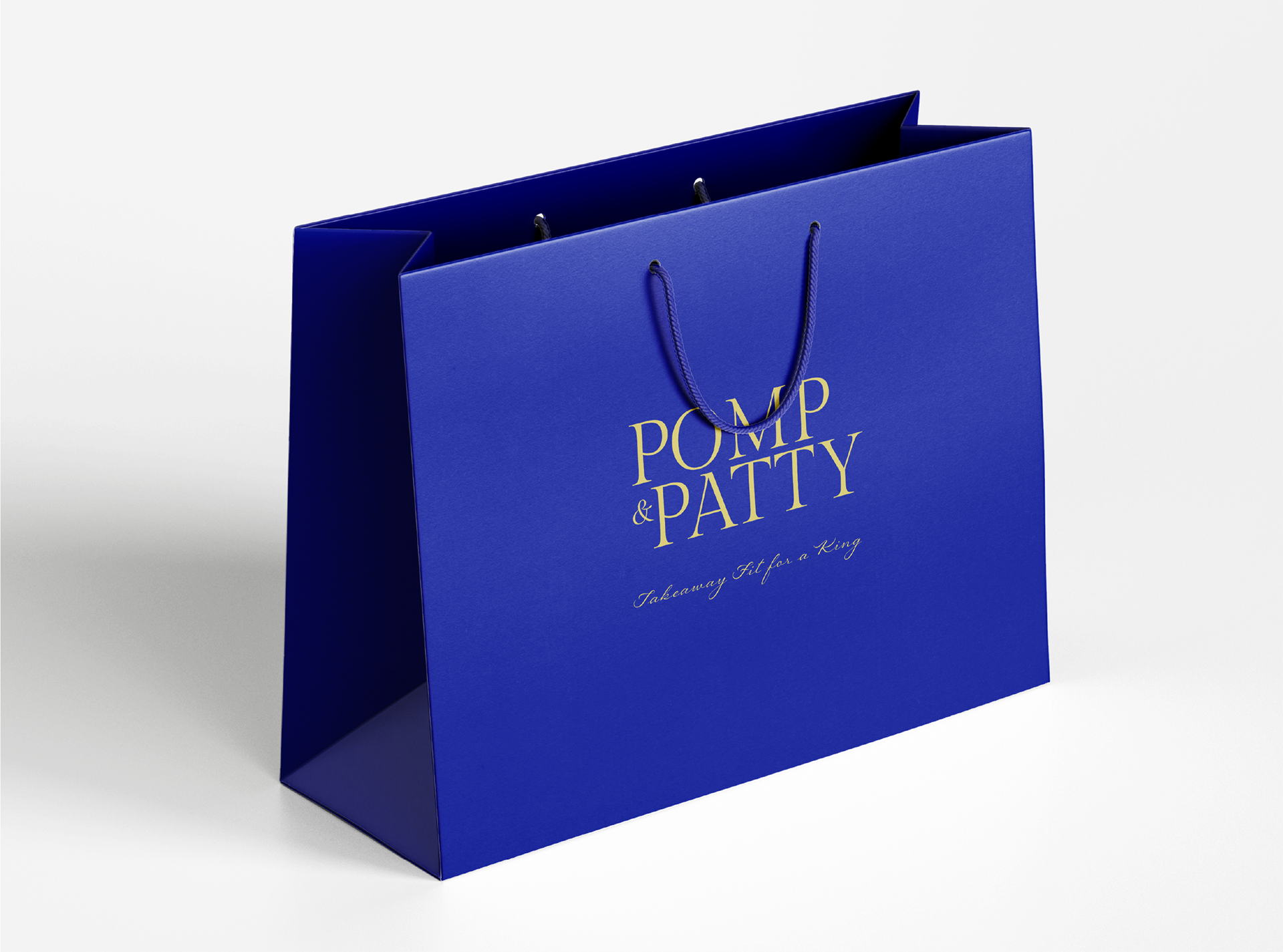
The name Pomp & Patty explores this joining of two contrasting worlds; luxury vs greasy takeaway. 'Pomp & ' comes from the title of Elgar's famous British piece 'Pomp and Circumstance' whilst also translating to mean 'ceremony and splendid display'. This represents the royal aspect. 'Patty' is exactly what it says on the tin and represents the casual takeaway aspect. Pomp & Patty together is the pairing of fancy & cheap, a humorously clashing pair.
(Personal Project)
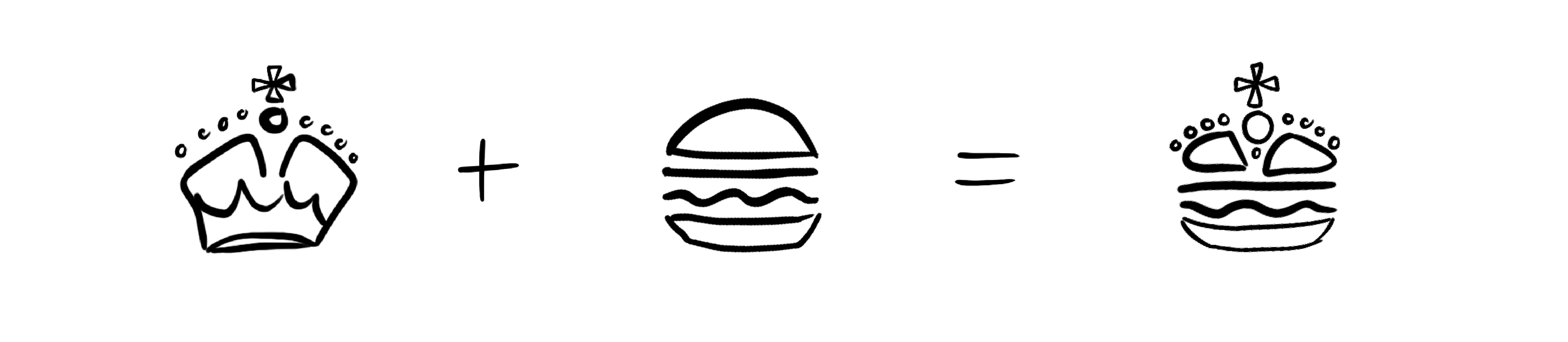

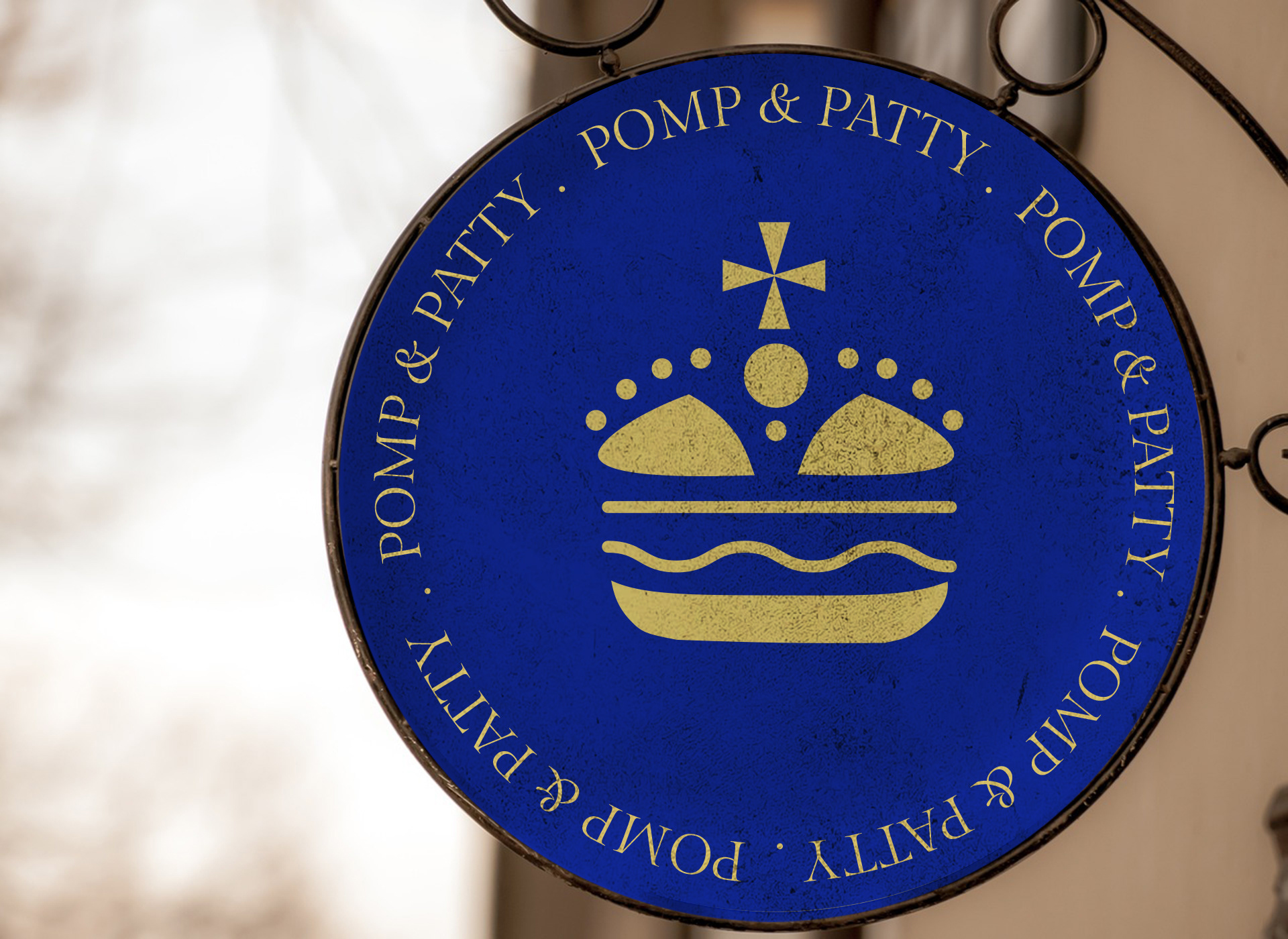
POMP & PATTY LOGO ICON
The logo consists of a crown and burger joined together to resemble the fusing of these two worlds. This is the brand's official logo.
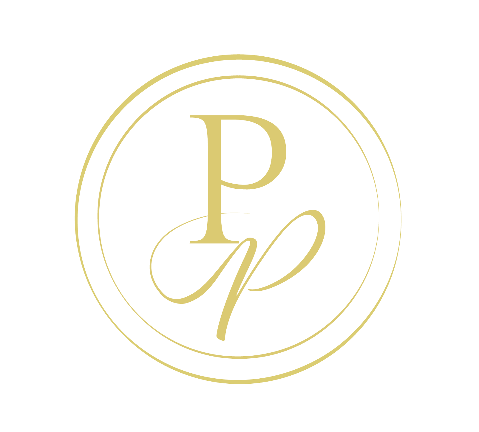
POMP & PATTY ROYAL CYPHER
Inspired by British royal cyphers, a brand monogram was also developed. By using the classic serif and the script font from the type lockup, this is once again showing the joining of two contrasting worlds.
This is used as a short hand for the brand, whilst the burger crown is the official logo.
ILLUSTRATION STYLE
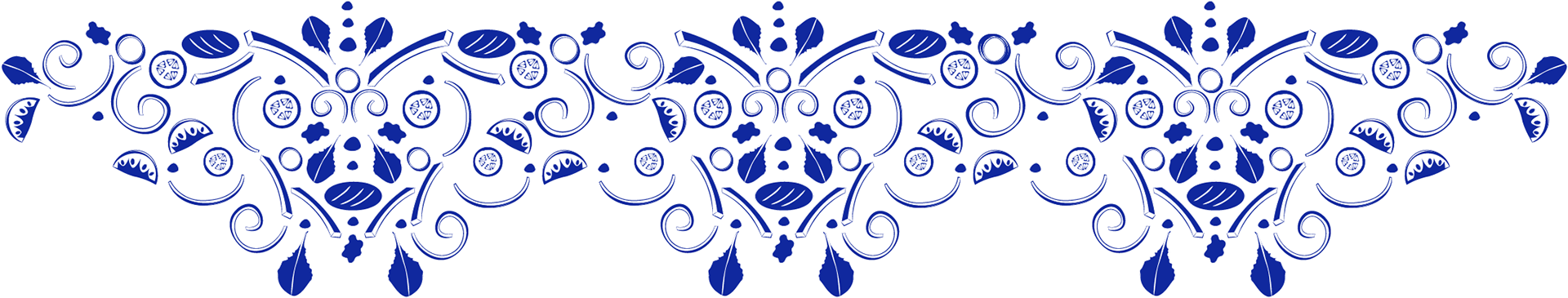
Illustrations were inspired by ornate decorations found on chandeliers, palace painting frames and palace walls.
To combine regal patterns with burgers, I created various simple illustrations of ingredients found within a burger. These were then arranged in patterns similar to those found within a palace.
At first appearance perhaps it appears to be a traditional ornate pattern, but if you look closer it is in fact just an onion, a tomato or a lettuce leaf. This may appear expensive, but underneath it all it is still just an opportunity for your burger fix!

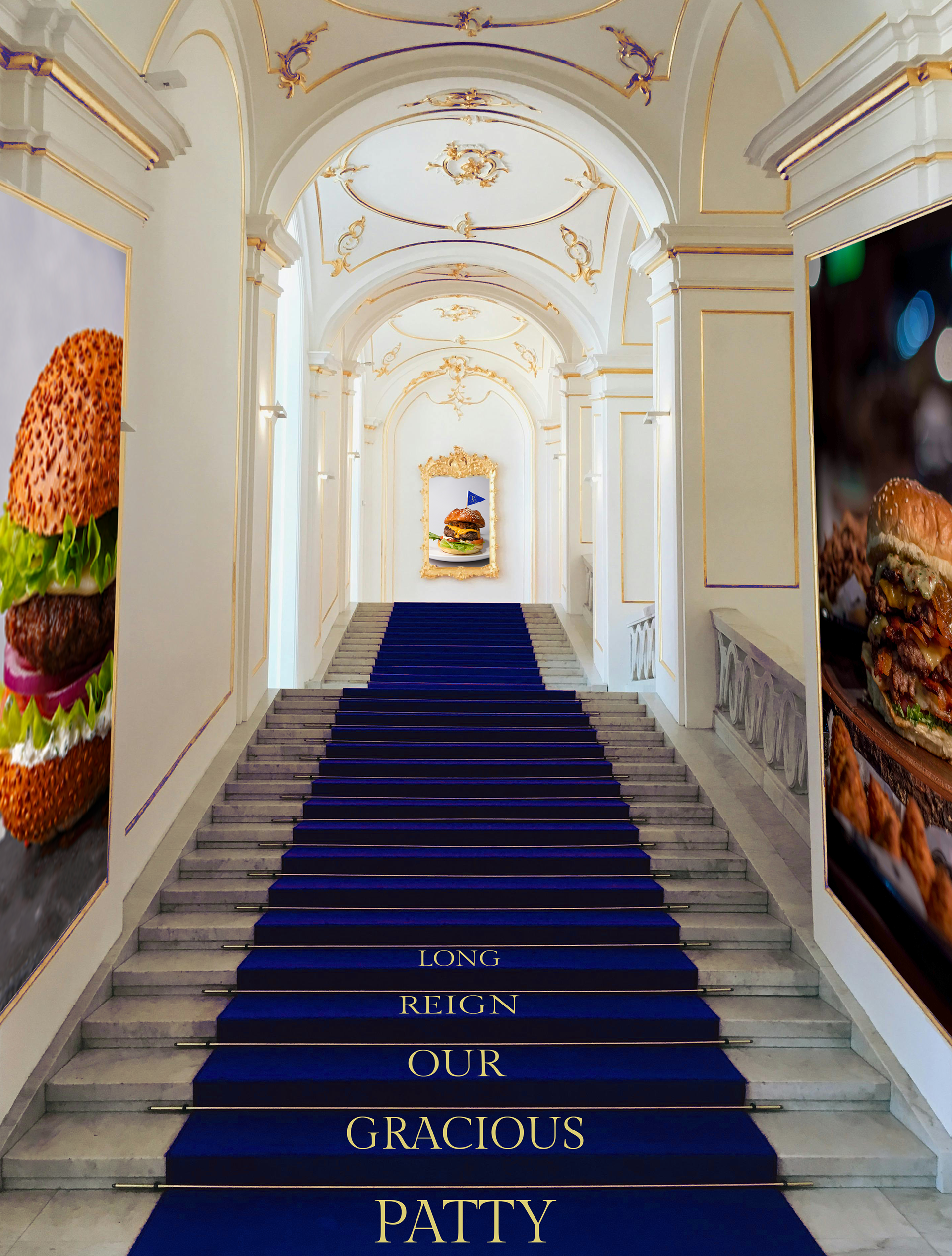
Entry to the store involves an eccentric walk way, reminiscent of a palace, only everything is dedicated to burgers in all their glory. The contradiction creates the desired tension here.
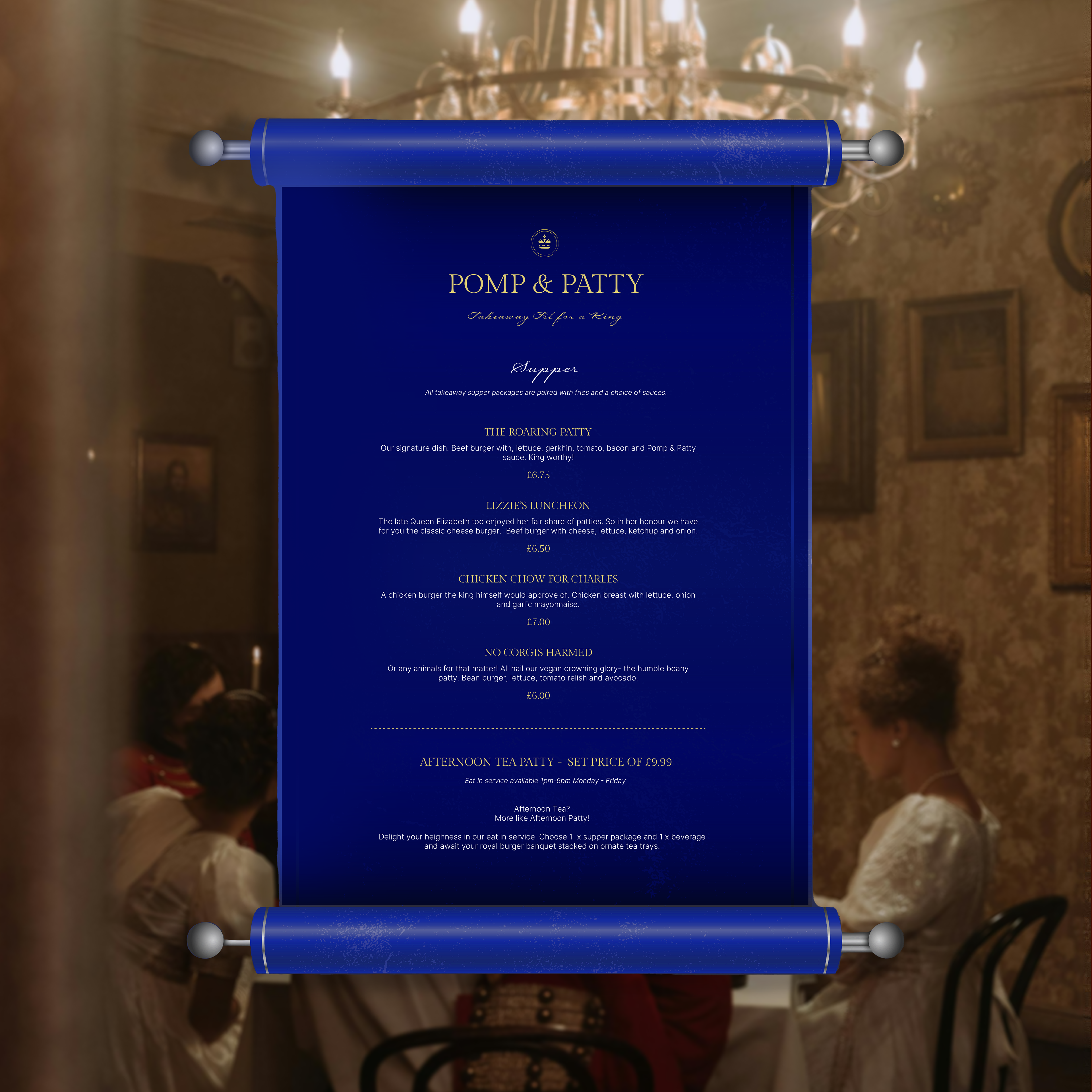
In true royal fashion, the menu comes in the form of a scroll. This is 'Patty A La Carte'. The contrast of luxury and cheap is explored here again. Whilst the menu appears serious, humorous tone of voice and low prices reveal the takeaway aspect, as well as references to the royal family a royalist may enjoy.
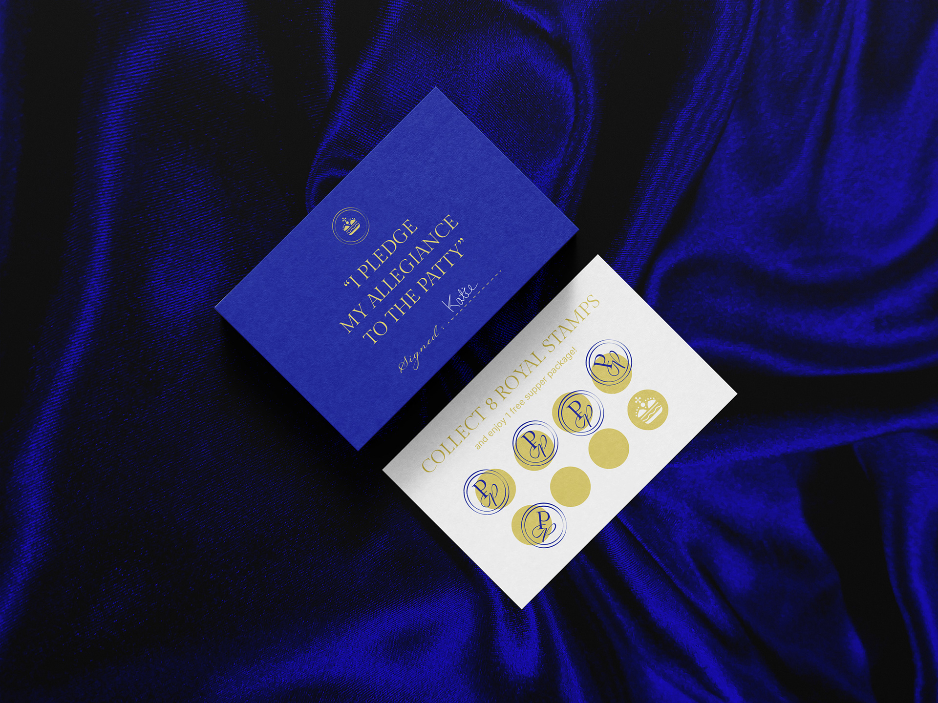
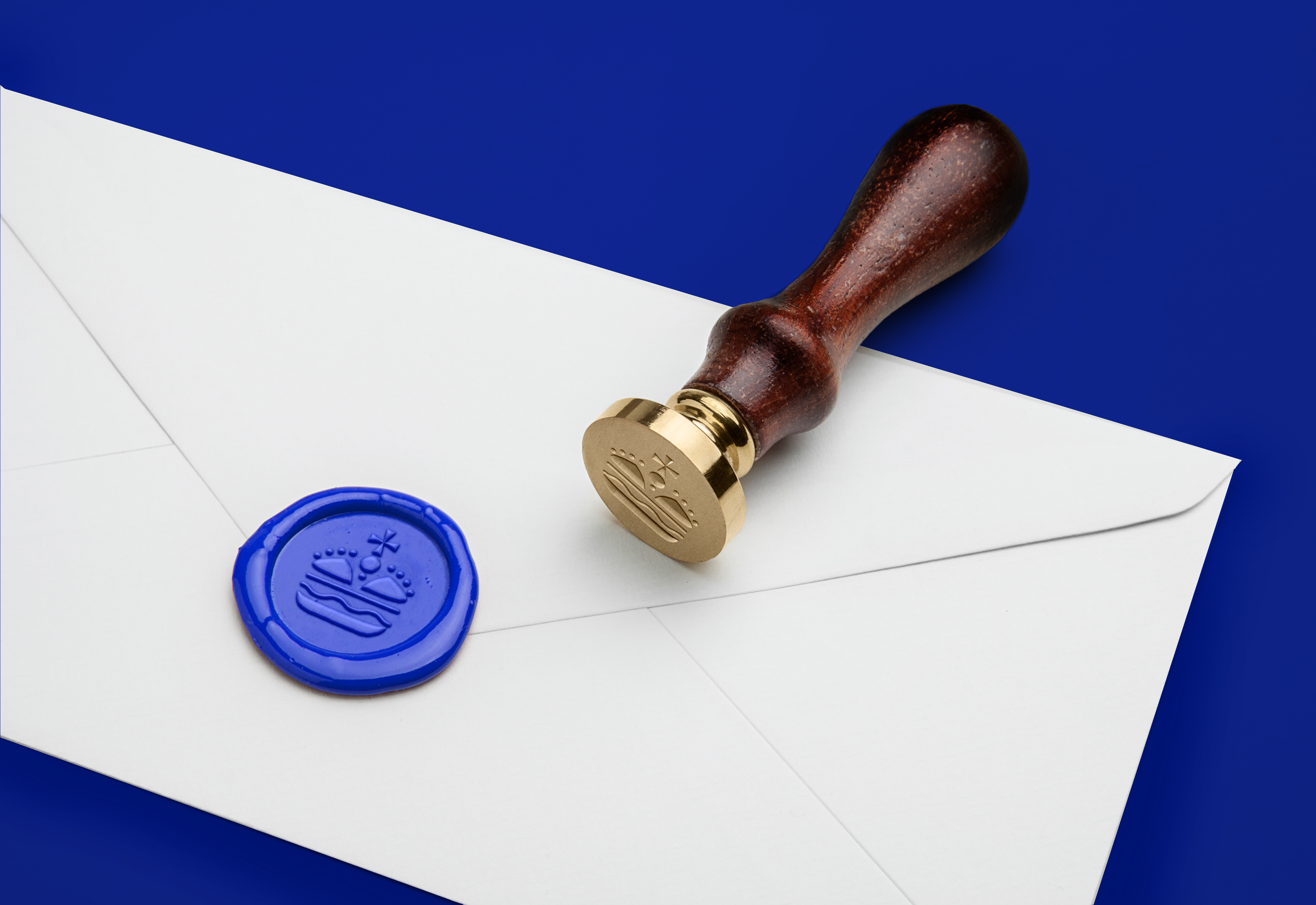
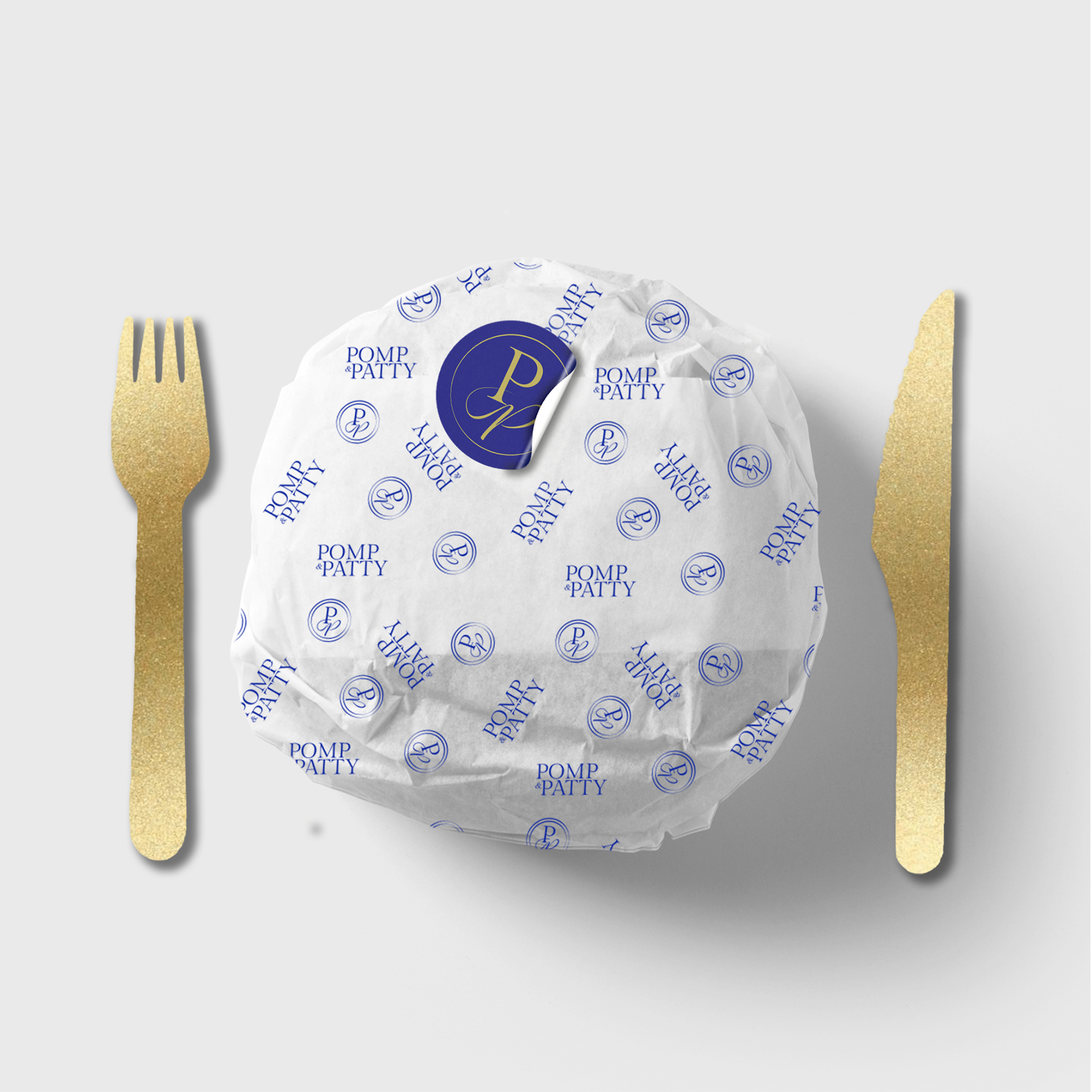
Each receipt comes in an envelope with a wax seal. This is the seal of the Pomp & Patty realm. Traditionally, blue seals are used for documents relating to the members of the royal family themselves, therefore the brand's wax seal always appears in blue to reinforce how within the store, you too as the customer are regarded as royal.
The main colour palette involves royal blue, gold and white but there is also an extended colour palette. This, as seen below, is to reflect the general colours found within your typical burger and the characterful takeaway aspect to the store. These colours are used to refer to the different burger meals or used sparingly for decorative elements within the brand.
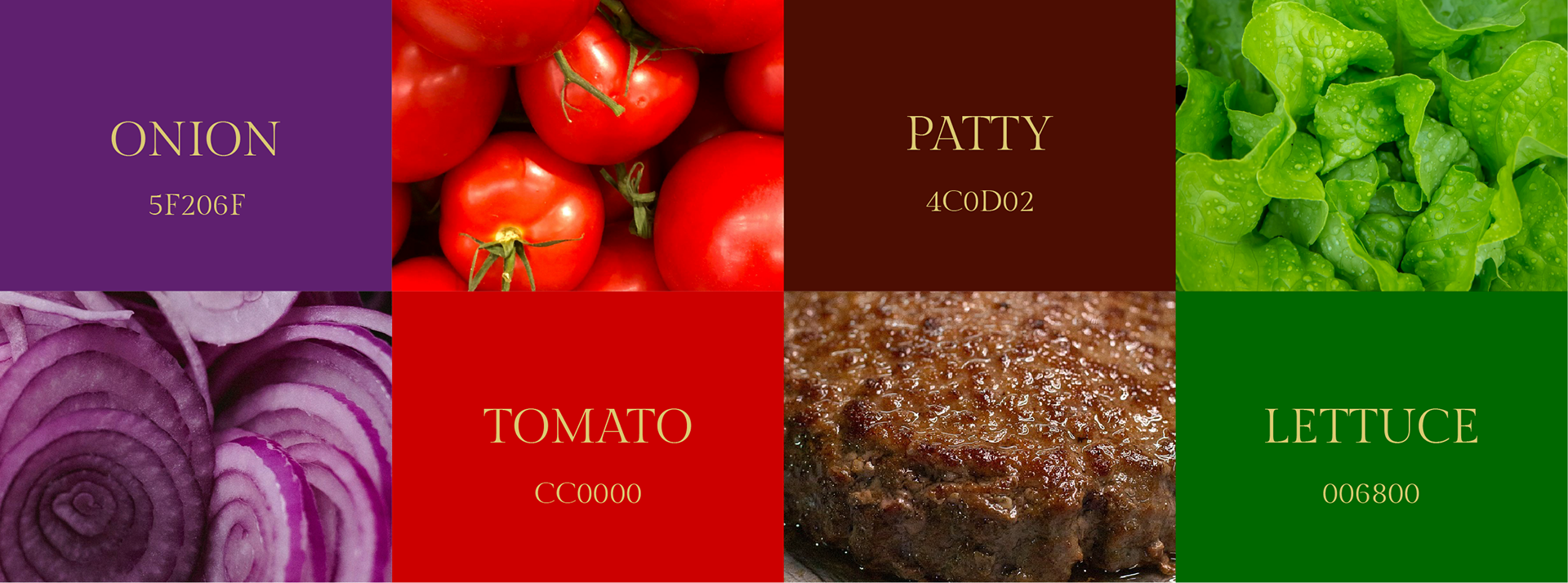
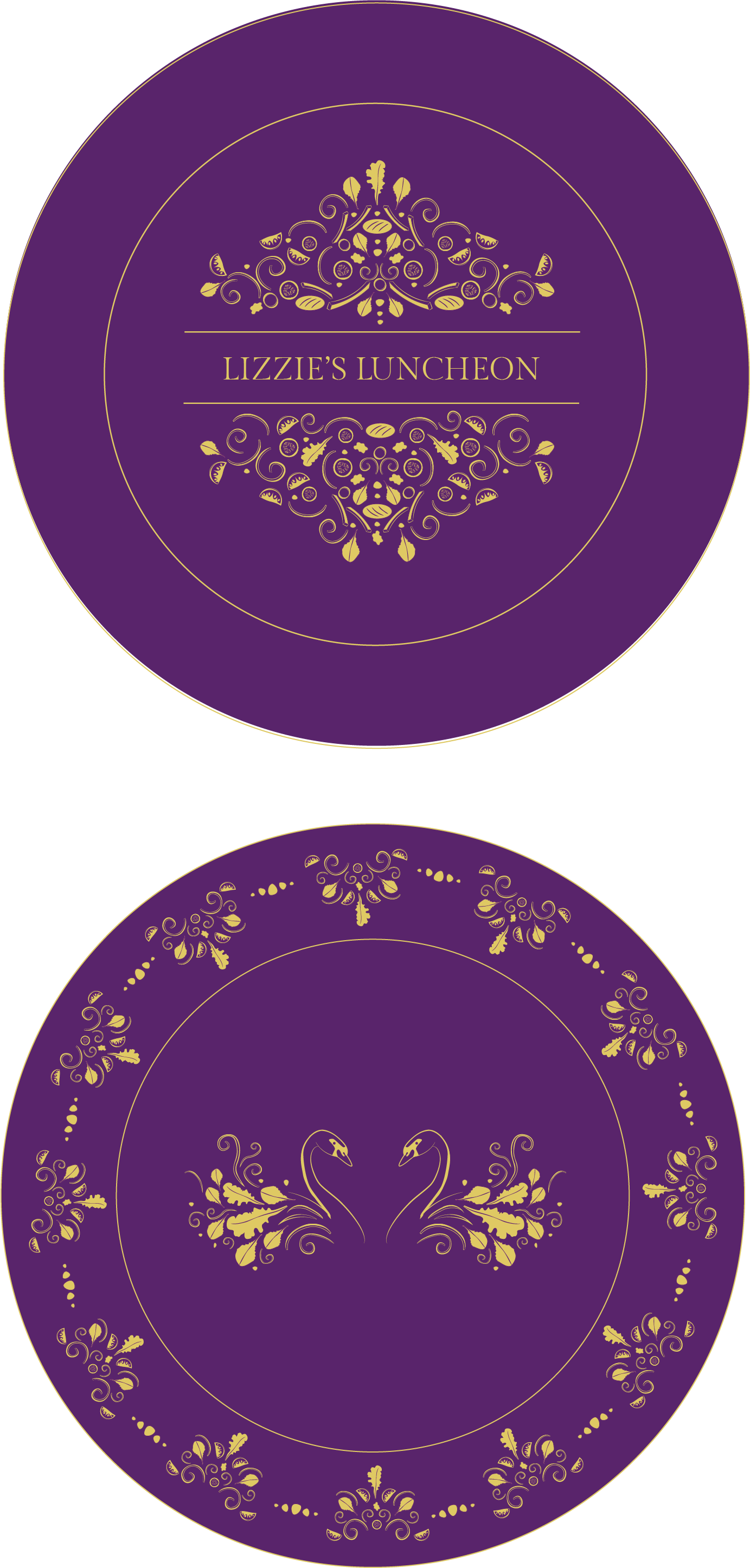
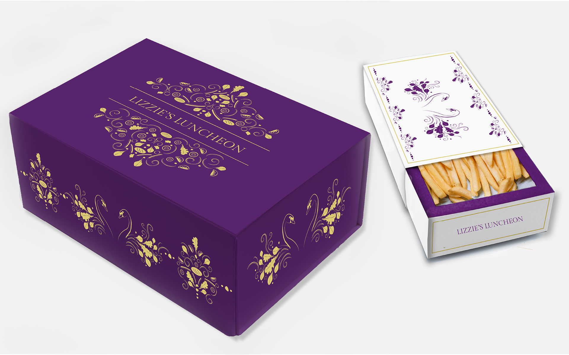
The same pattern of burger ingredients is used for each of the 4 flavours, only the colours and the names are altered. The names either refer to a certain royal member, or royal associated animals.
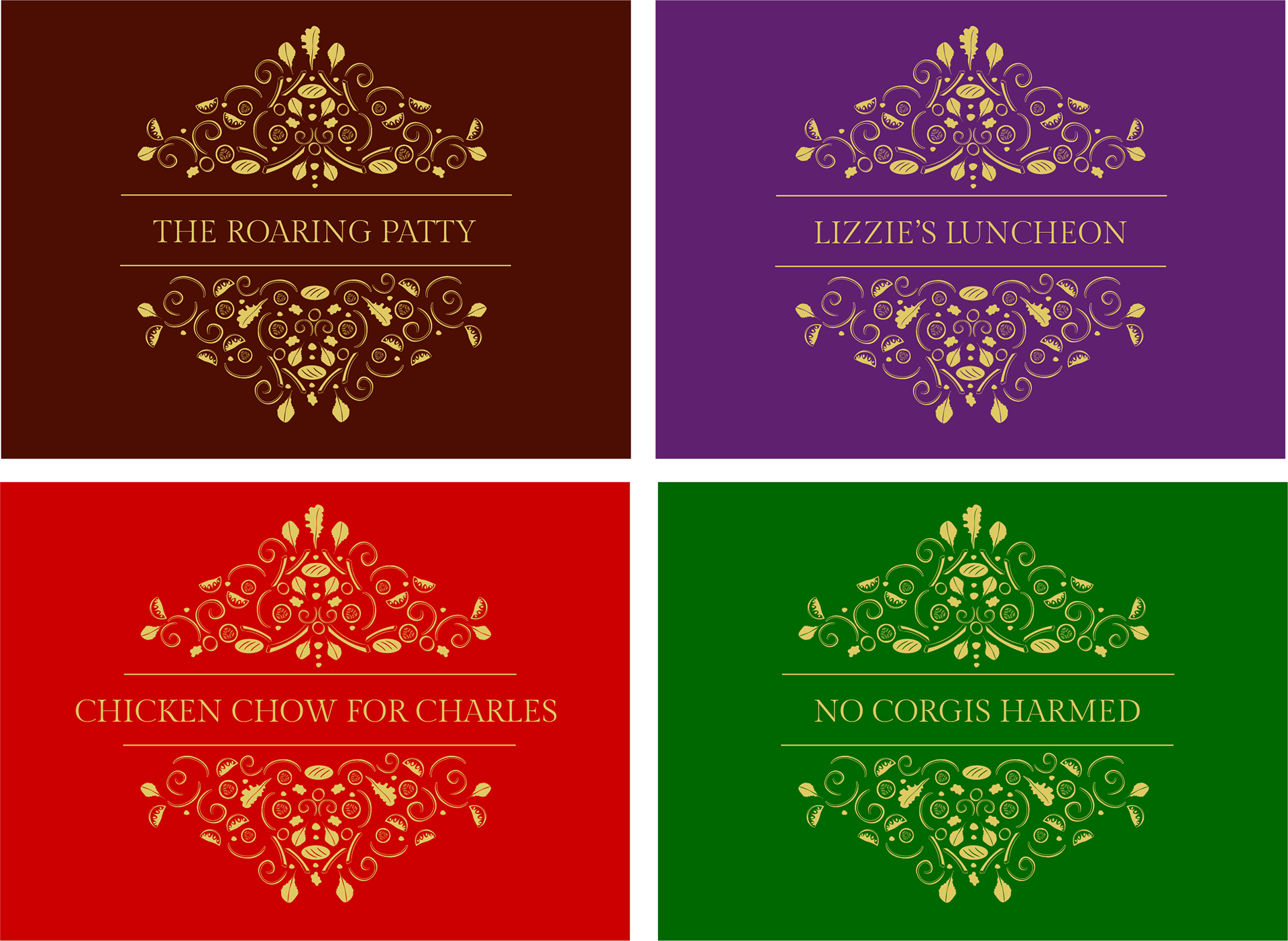

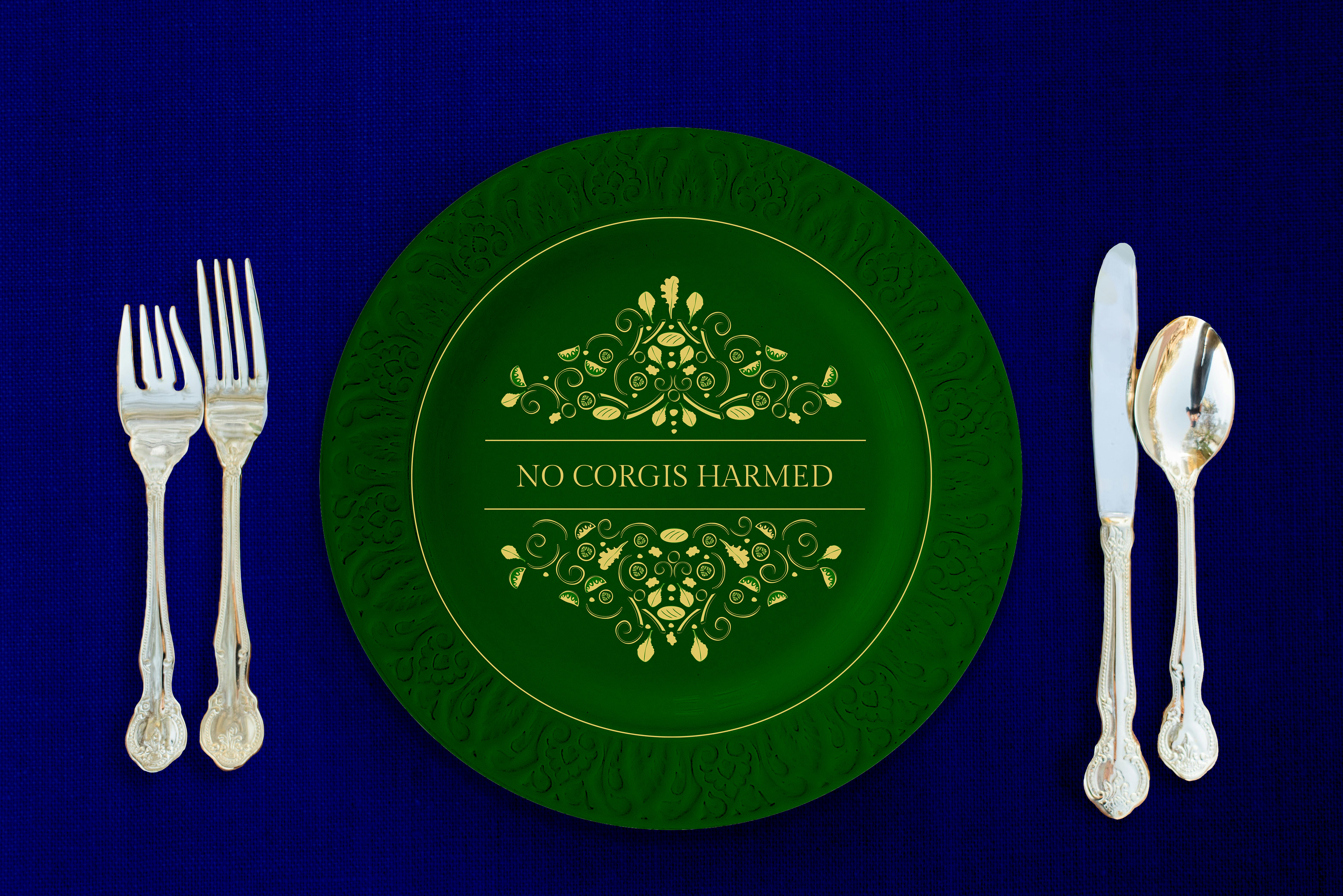
Each of the 4 burger options come with their own ornate illustration pattern and feature references to royal-associated animals.
LIZZIE'S LUNCHEON features swan inspired illustrations, 'THE ROARING PATTY' features lions, 'CHICKEN CHOW FOR CHARLES' features horses and 'NO CORGIS HARMED' features corgis.
The style is once again deliberately irregular/free flowing to reflect the rustic haphazard feel of a typical takeaway store. The same burger ingredients are used for these illustrations as well as minimal extra details added.
Takeaway packaging comes in ornate embellished boxes, all in the colour of the chosen flavour with white and gold. These boxes are collectable, similar to how the royal plates are collectible.
Taking the royal experience to the next level, each customer is supplied with wooden cutlery painted gold with every takeaway purchase.
The unnecessary use of a knife and fork to eat a burger shows the eccentric nature of the brand as well as furthering the obsession with royalty and sophistication.

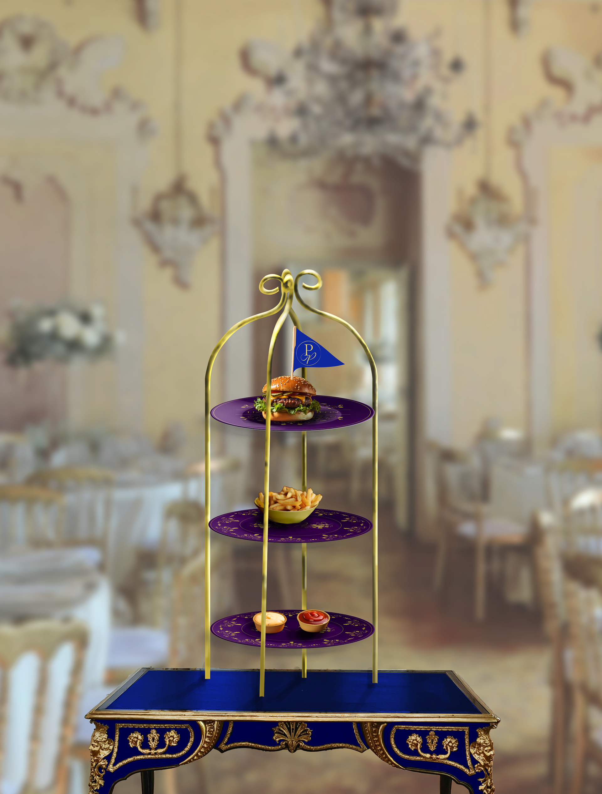
Despite being mainly a takeaway store, an eat in service is also provided. In true British style this is afternoon tea with a twist. Introducing 'Afternoon Tea Patty', where scones and dainty cakes are replaced with greasy burgers and fries.