THE ASK
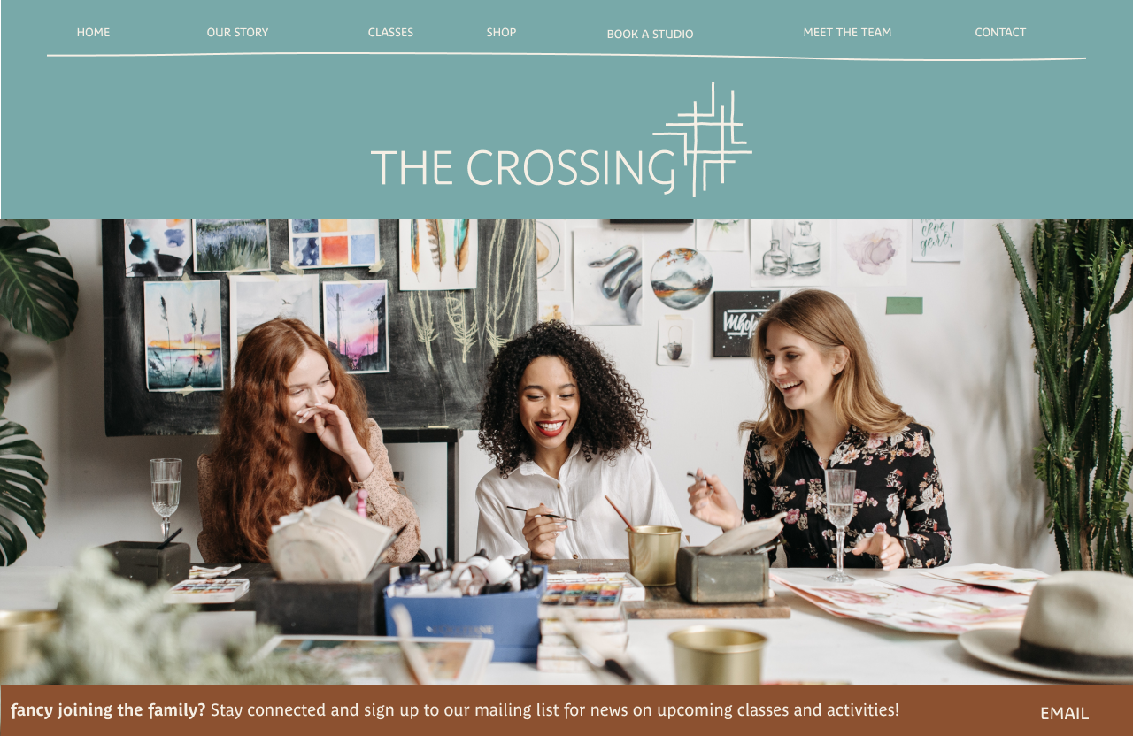
To design the start-up brand identity of a maker’s space in the busy streets of Liverpool’s Baltic Triangle. The space should offer opportunities to practise a variety of crafts as well as the opportunity for like-minded creatives to meet.
THE SOLUTION
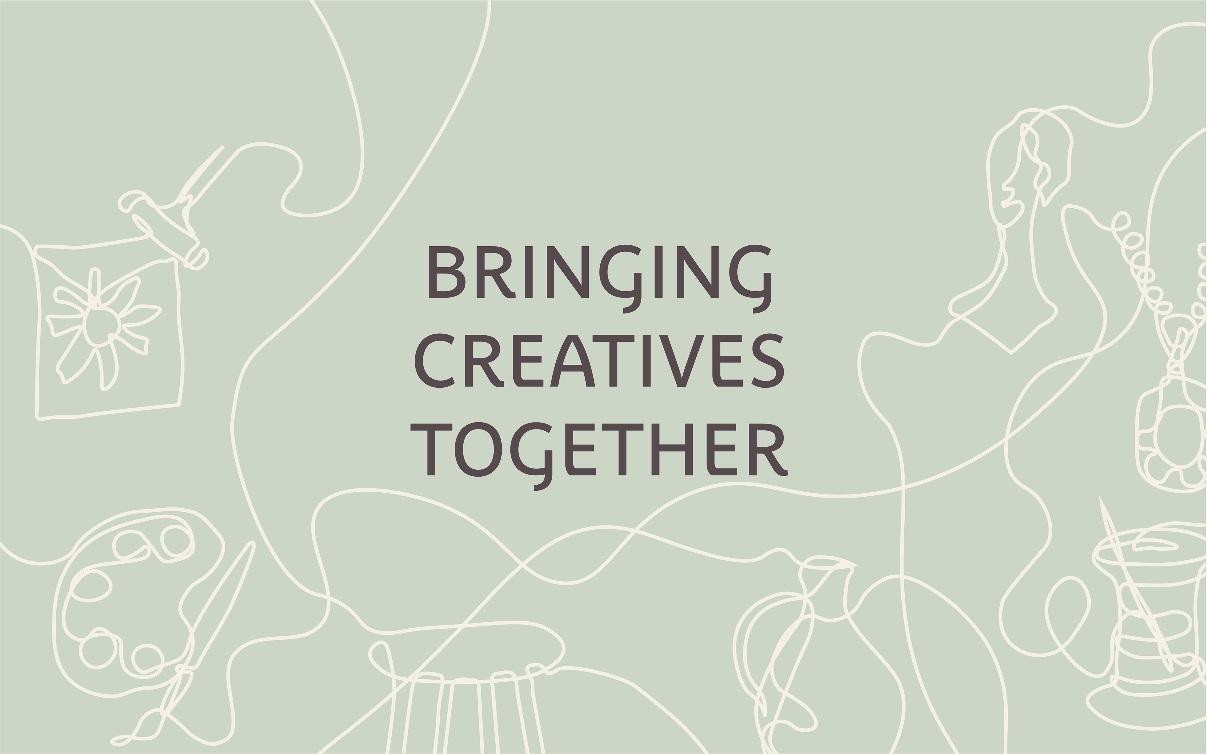
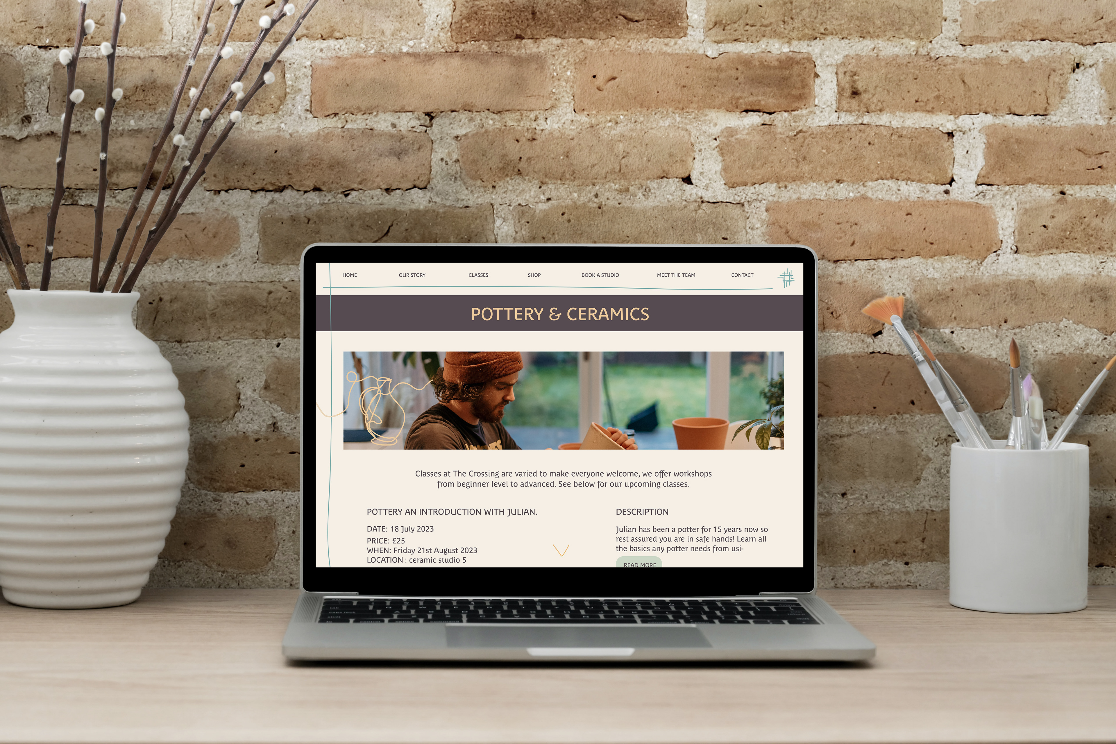
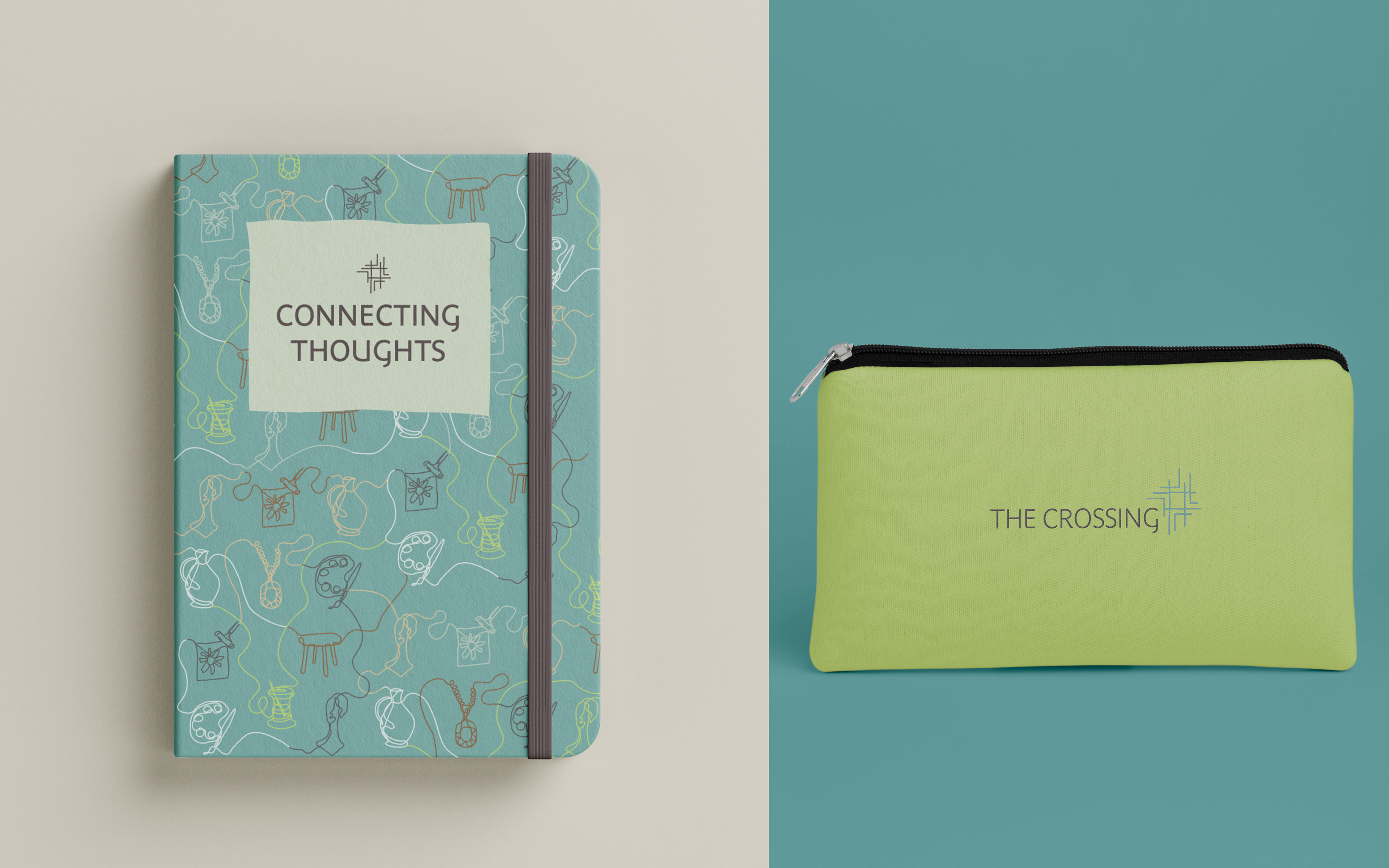
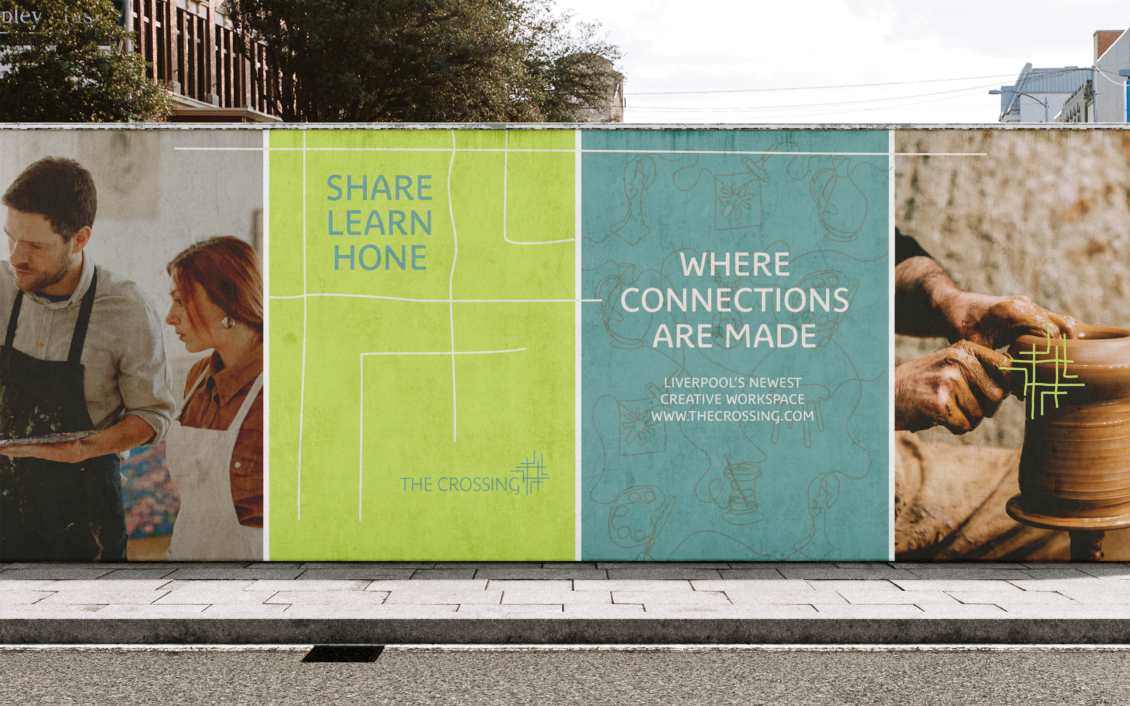
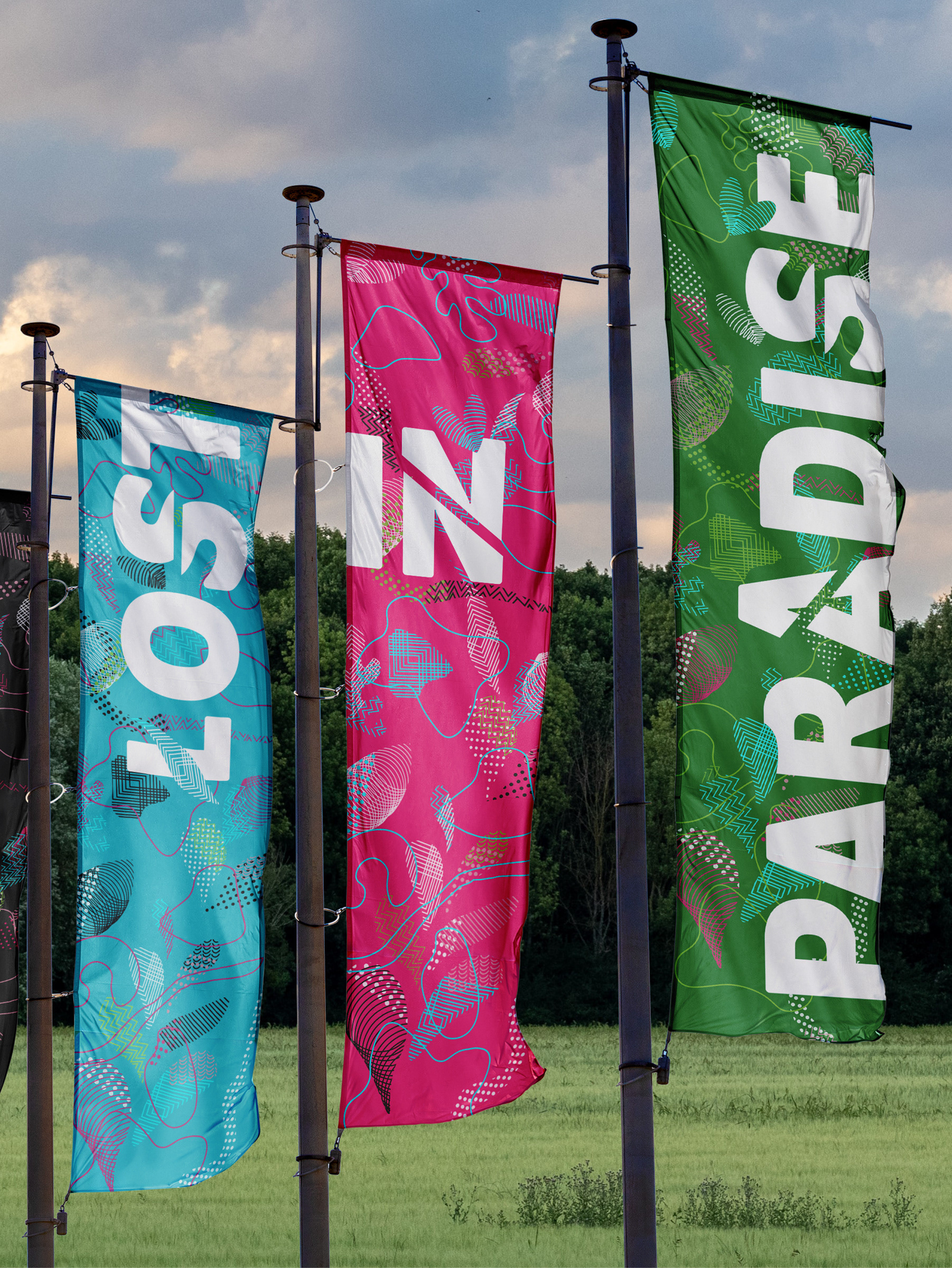
The Crossing focusses on connecting people through a community spirit. With organic lines and a warming palette it offers a modern yet friendly and grounded feel.
(Student Project)
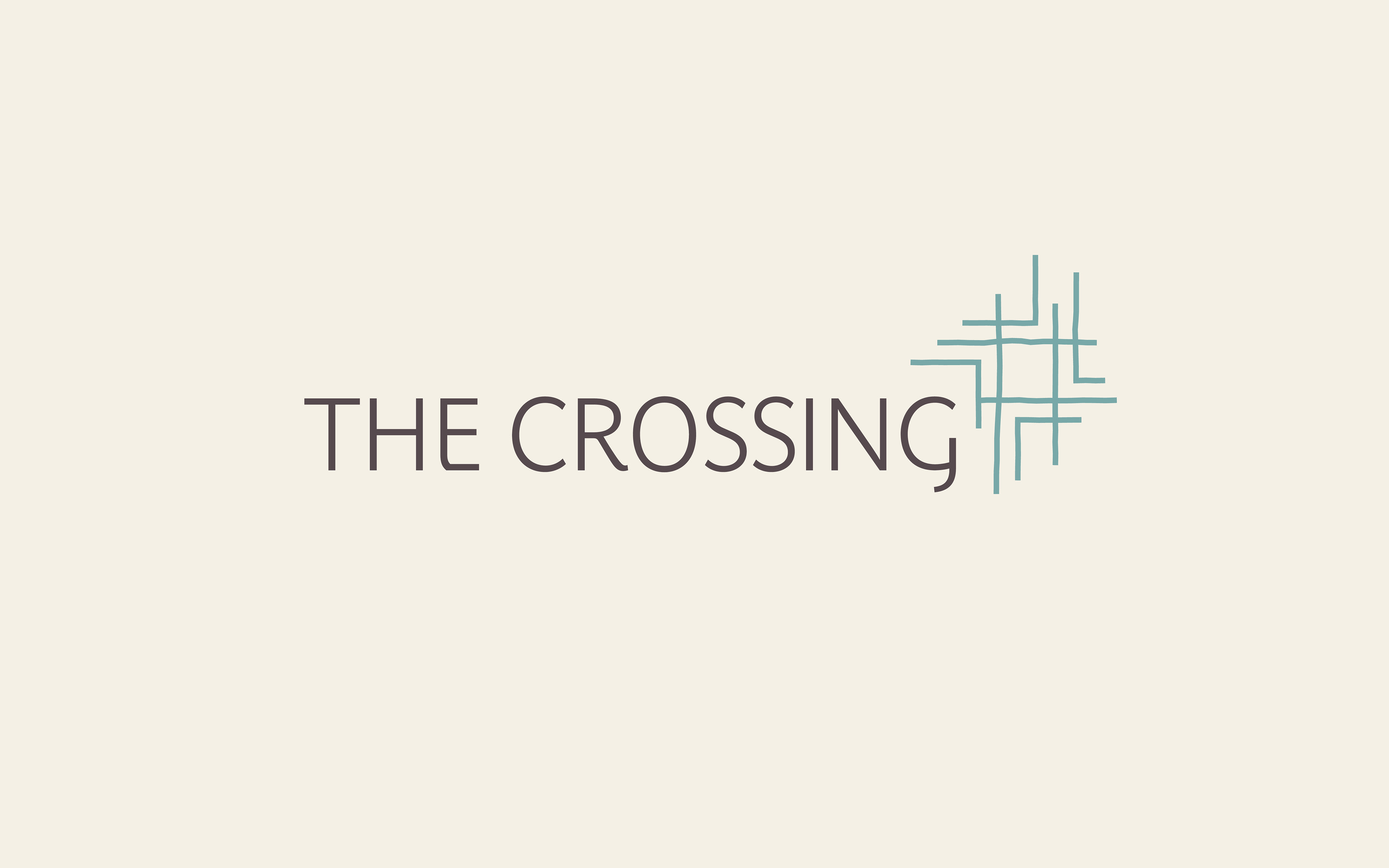
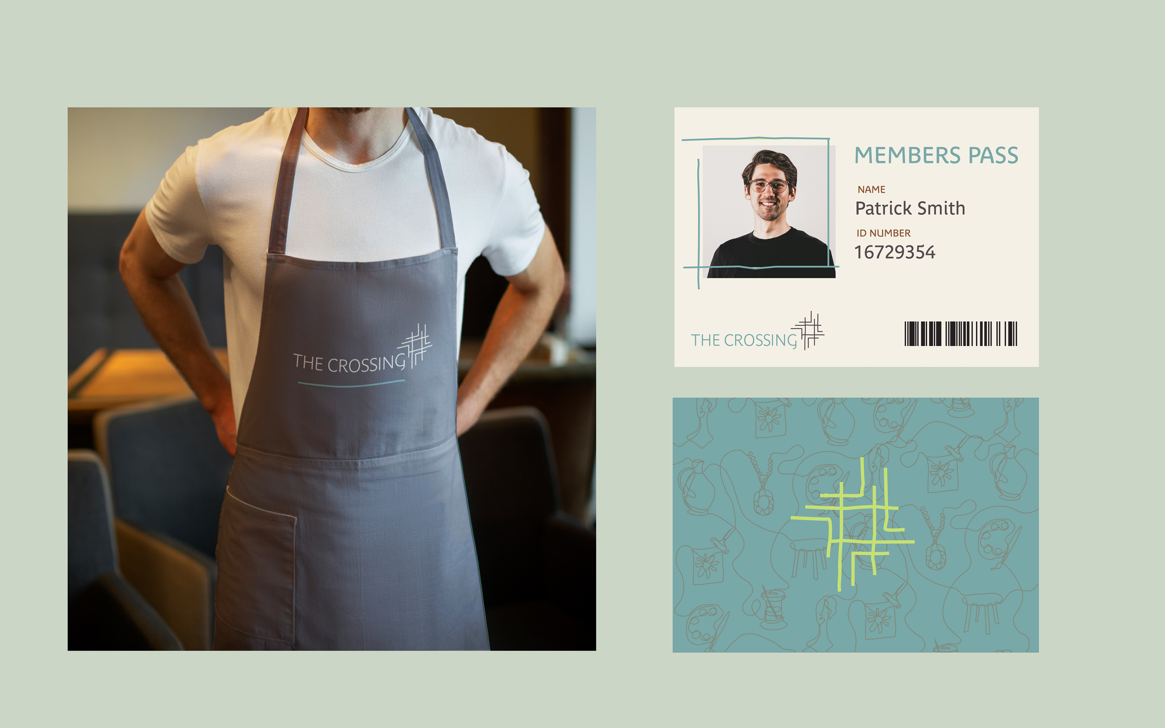
The logo consists of a friendly modern sans serif typeface next to a cross-shaped icon. The organic style used to draw the icon is reminiscent of something perhaps hand stitched whilst literally referring to the brand's name, 'The Crossing'. The icon is made up of a variety of irregular hand-drawn lines that come together to create a square within the centre. This refers to how it is the centre of the creatives and where creative paths can cross.
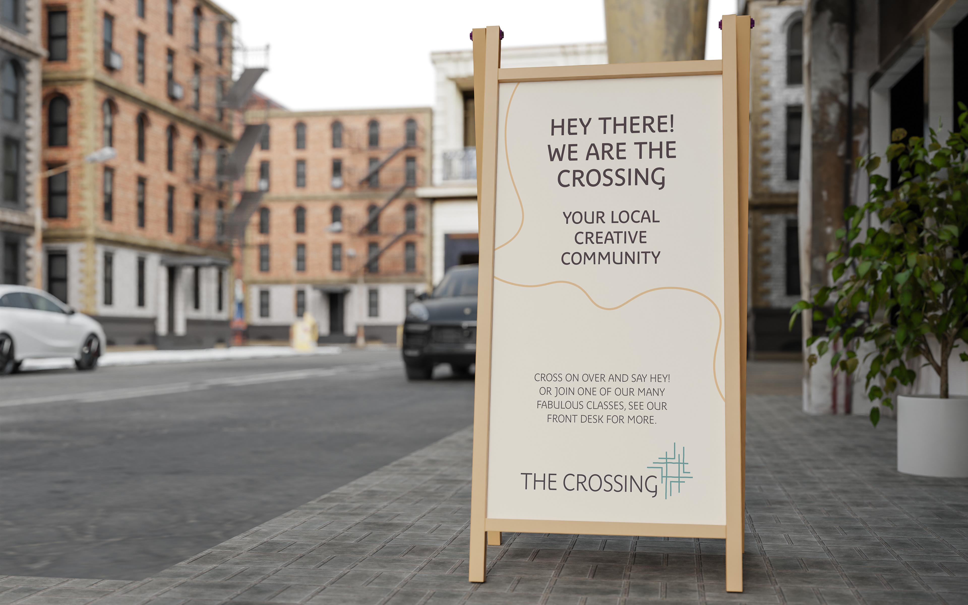
This is an inclusive space for locals to share, learn or hone their skills in the crafting world. I therefore identified the brand values to be: community-minded, connecting, contemporary and the concept summed up as 'crossing paths, making connections'.
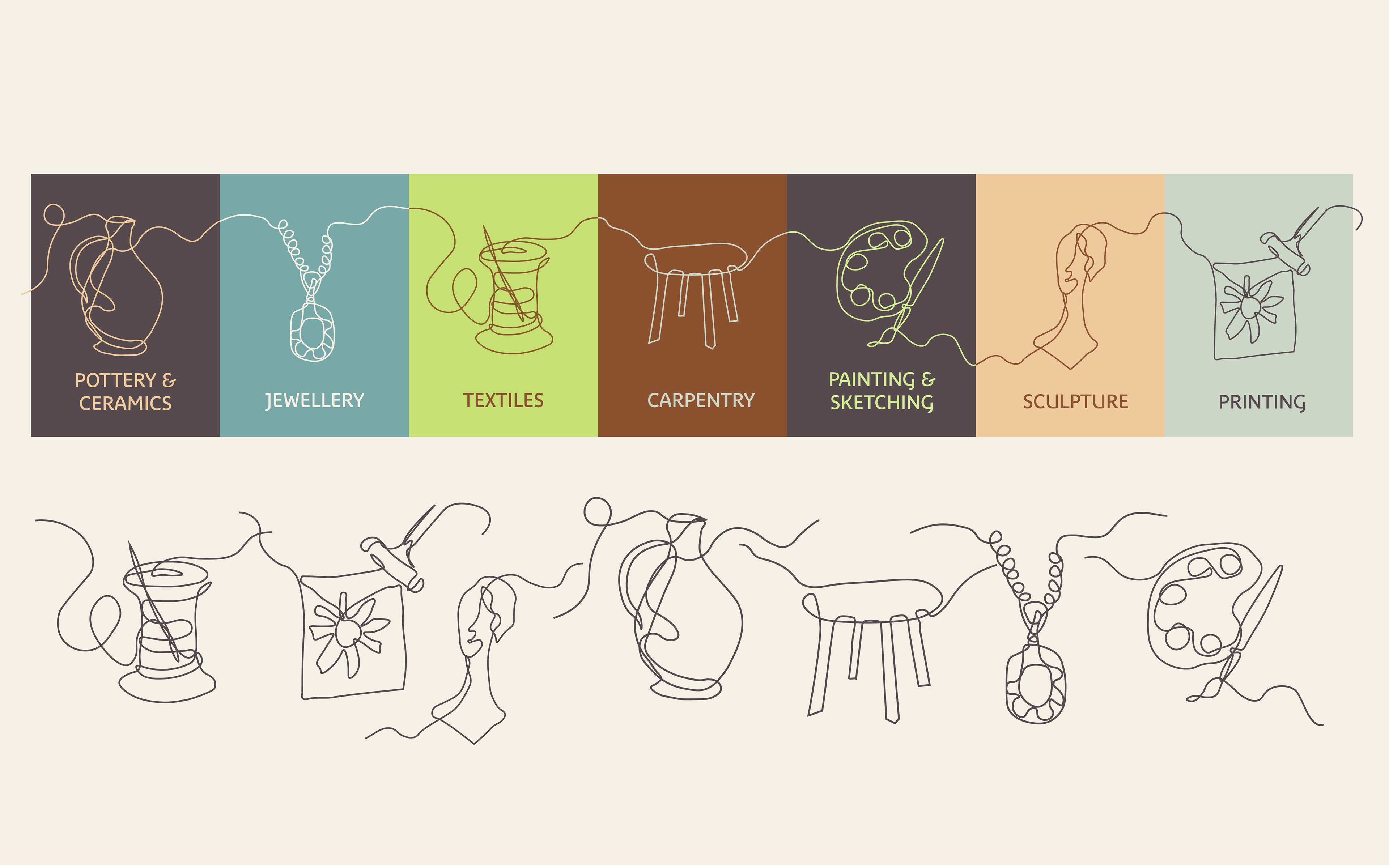
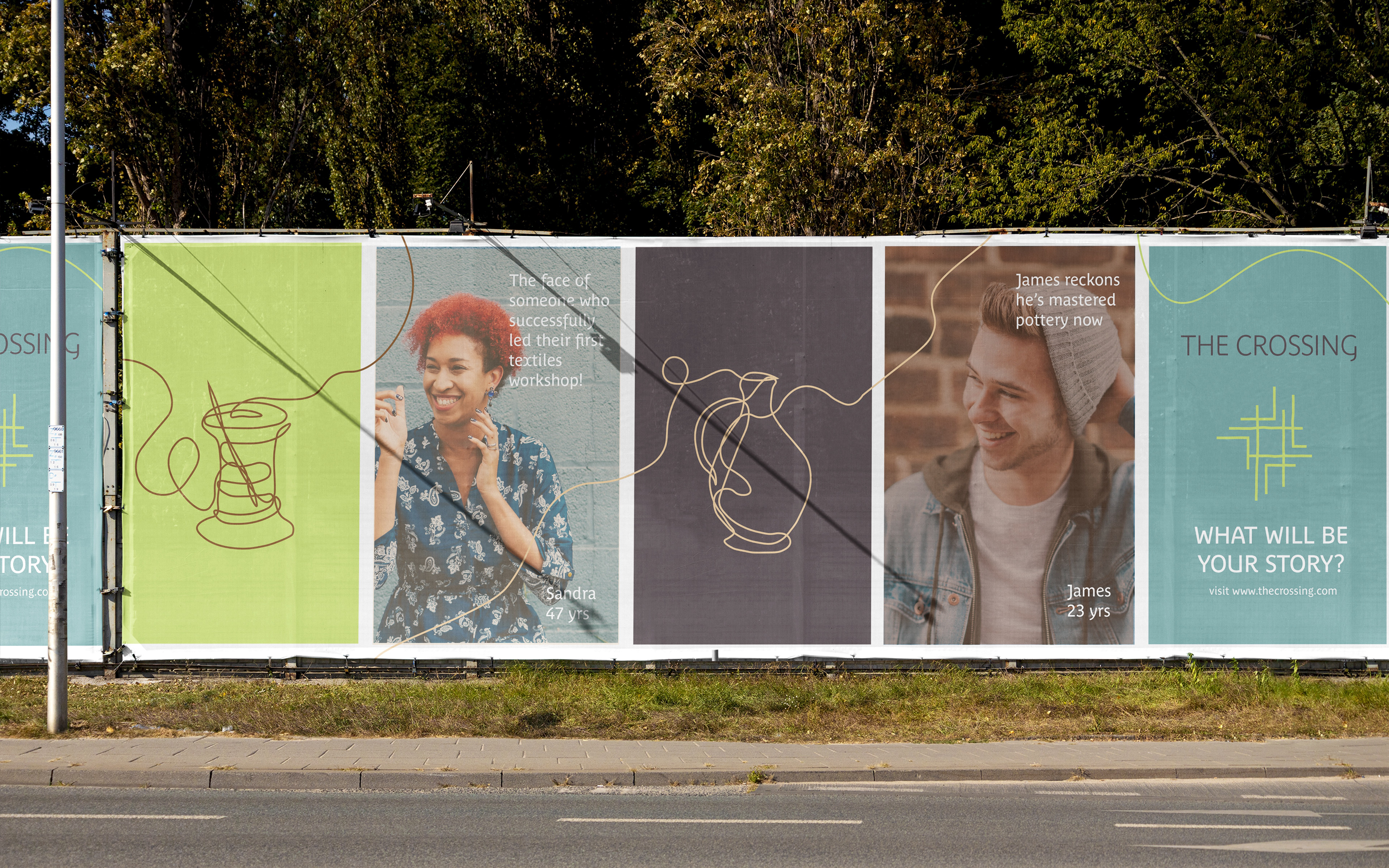
A major visual element of the brand is continuous line-drawings to show the variety of crafting activities available here as well as giving the identity a friendly and artistic appearance. The free-flowing illustration style allows the lines to cross over and interconnect with one another. This refers to the community spirit of the crafting space, and the connections the people will make here.